Education · Mobile Application

Making mobile learning work when internet access isn't reliable.

Fanos LMS app overview
Duration 6 weeks
Role Product Designer, UI/UX Designer & Researcher
Platform Mobile Application
Client STEM
Services UX Research, UI Design, Prototyping
Go to the App

Overview

A learning platform designed around the reality of its users

Fanos LMS is a cross-platform mobile learning application designed to bridge the digital education gap for high school students. Developed as part of the STEEP initiative (STEM Education for Empowerment Project), the platform focuses on delivering structured STEM courses, national exam preparation, and interactive learning tools tailored specifically to support adolescent learners and increase access to high-quality secondary education.

Instead of designing for an ideal environment, I explored what learning looks like when connectivity, device resources, screen space, and attention are limited.

The experience is built around a simple learning loop:

Learn Practice Prepare Track

Core question

“ How can we make learning easy to start, continue, and return to even when the internet isn't reliable?.”

The Challenge

Learning shouldn't stop when the connection does

Students may rely on entry-level or shared Android phones and have inconsistent access to the internet. At the same time, STEM learning can require dense explanations, diagrams, formulas, and practice activities on relatively small screens.

This created four key challenges:

Unreliable connectivity

A lesson or quiz that depends on a live connection breaks the moment the network drops.

Small screens

STEM needs diagrams, formulas and answer choices. All of it at once is overwhelming on a phone.

Too much to hold in mind

Lessons, practice, revision and exams. Without structure it's hard to know where to continue.

Limited device resources

Entry-level and shared phones run out of space, so downloads have to stay manageable.

Design Solutions

Designing around the conditions students actually learn in

I translated those constraints into product decisions that make the learning journey more focused and flexible.

HahuJobs personalized home screen
01. Learn

Starting a lesson should feel straightforward

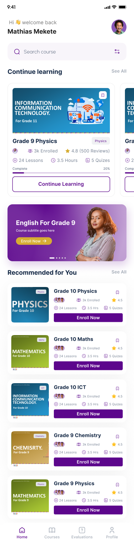
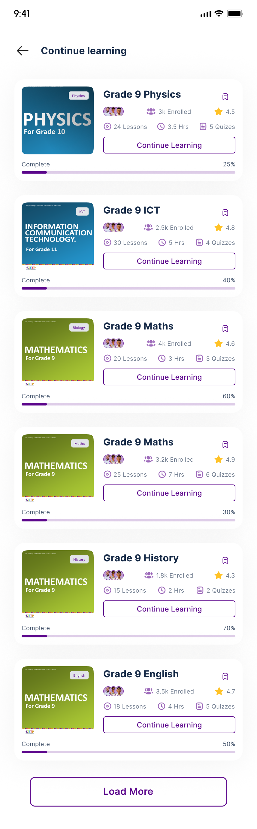
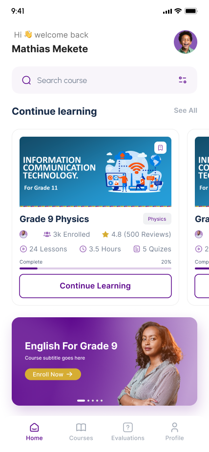
The home experience gives students a clear starting point by surfacing active courses, learning progress, and the next lesson to continue. Instead of making students search through the platform every time they return, the most relevant learning content is brought forward.

Focus: Active learning · Course discovery · Progress visibility · Continue learning
HahuJobs personalized home screen
02. Watch, Review & Practice

Learning shouldn't stop when the video ends

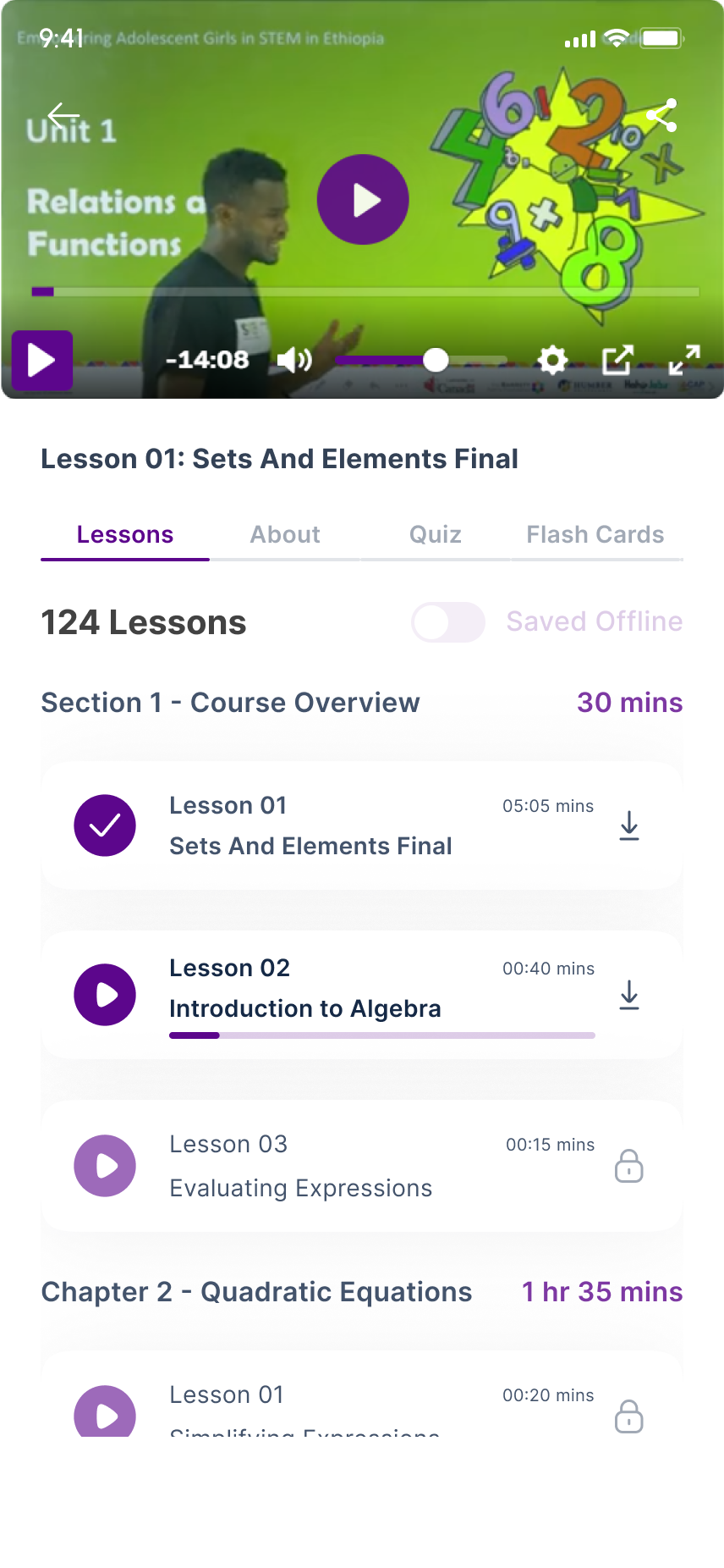
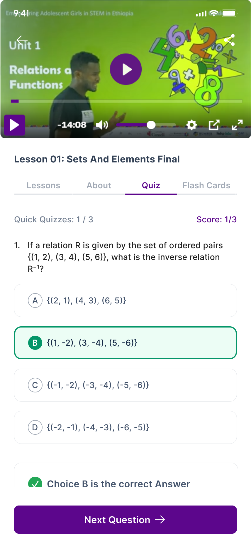
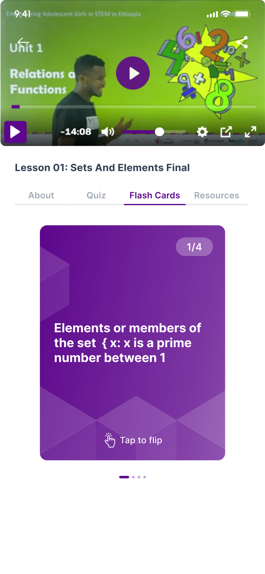
The lesson experience keeps video, flashcards, and quizzes within the same learning context. Students can watch a lesson, review key concepts, and test their understanding without leaving the course or searching for another activity.

This creates a simple flow:

WATCH → REVIEW → TEST Focus: Lesson continuity · Video · Flashcards · Quizzes · Immediate feedback
Donlaoded course
03. Save

Learning should still be there when the connection isn't

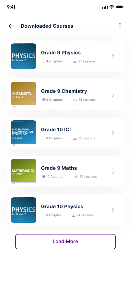
Students may not always have reliable internet access, so important learning materials can be saved for later use.

The download experience makes it easier to understand what is available offline and gives students a central place to manage saved content and device storage.

Focus: Offline access · Download status · Storage awareness · Learning continuity
exam
04. Prepare

Exam practice should keep students focused

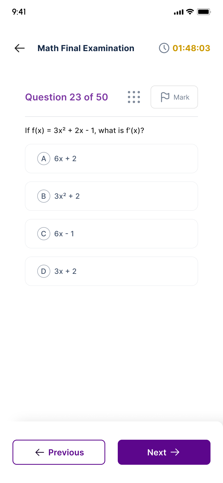
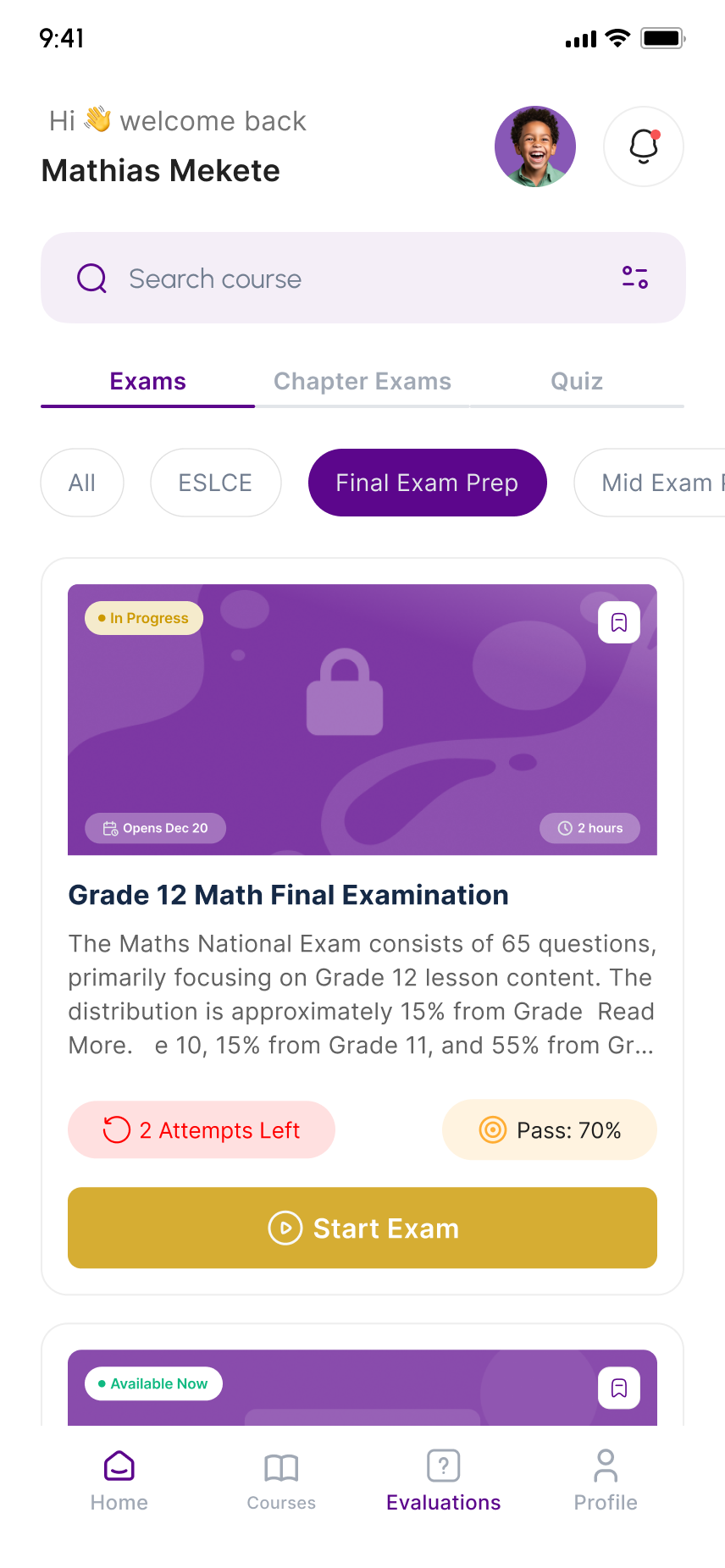
Exam preparation can put a lot of information onto a small screen: questions, answer choices, timers, progress, and supporting material.

I simplified the assessment experience by giving the question and answer choices the strongest visual hierarchy while keeping supporting information quieter and easier to access.

Focus: Question hierarchy · Focused layout · Timed practice · Clear feedback
Hahujobs skill assessment module
05. Track

Students should always know where they stand

Progress shouldn't require students to piece together information from different parts of the app.

The experience gives students a clearer view of their learning activity and completion so they can understand what they've finished and where to continue.

Focus: Progress visibility · Completion · Learning activity · Next steps

Selected Final Screens

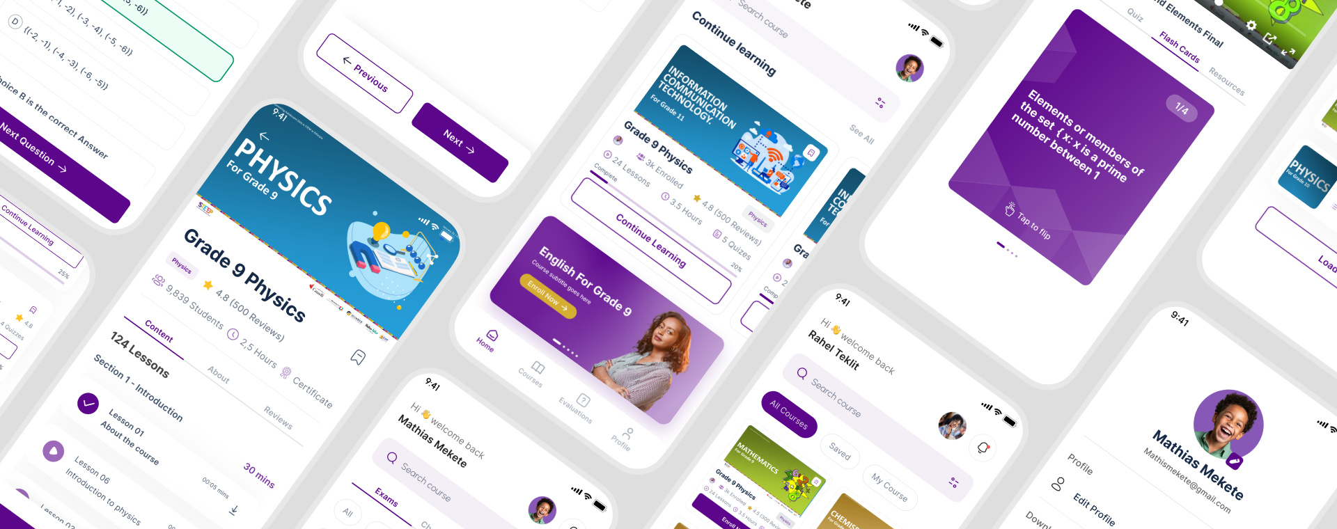
A closer look at the final product experience.

home screen
Home A central hub to continue learning, discover courses, and track progress.
courses
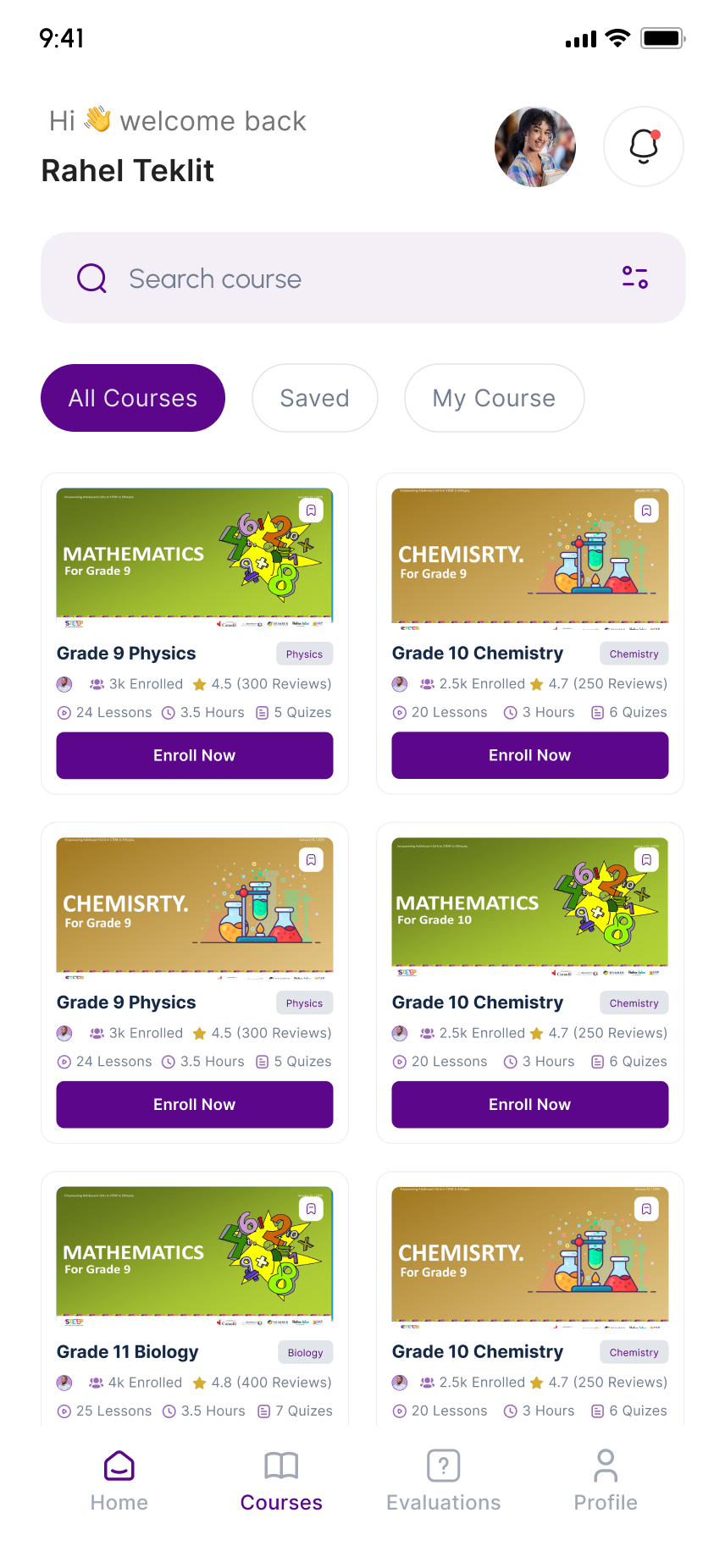
Courses Explore all courses, save ones to revisit, and manage your enrolled learning.
course detail
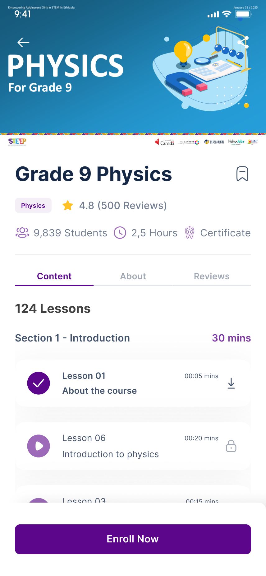
Course detail Helps students preview course content, reviews, duration, and enrollment details
video course
Learning Mode Organizes lessons into structured sections with progress and offline access.
Quiz
Quiz Practice and test understanding with instant feedback
Top companies dark
Flashcards Quick review with swipeable STEM concept Cards
Exam center
Exams Prepare for national and chapter exams with practice tests and exam prep tracks.
Exam center
Exam Mode Focused, time-bounded exam experience with navigation
Exam center
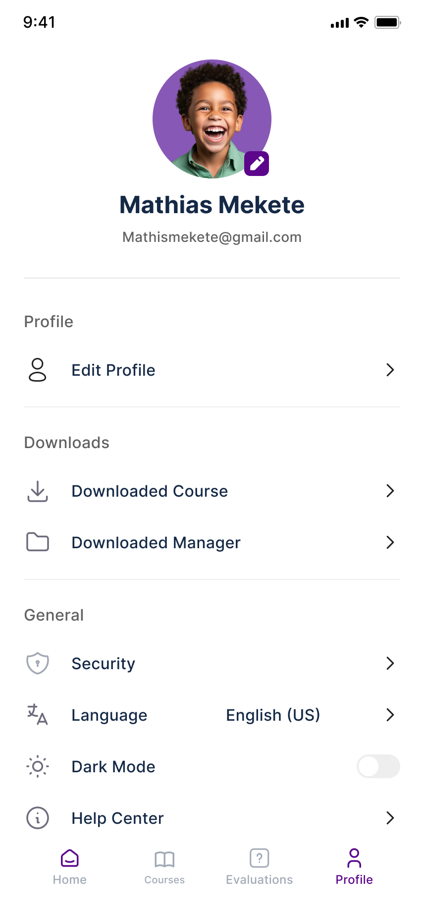
Profile Manage student details, preferences, and access downloaded courses and lessons offline.
Swipe to explore

Result

A more focused mobile learning experience

The final concept brings the learning journey into one connected experience from finding a course to completing a lesson, practicing what was learned, preparing for exams, and tracking progress.

The design makes several parts of the experience more deliberate:

The result is a more focused, flexible, and transparent learning experience that reduces unnecessary effort while giving students greater control over their learning journey.

Reflection & Takeaways

Designing for real-world constraints changed how I think about UX

Fanos taught me that offline learning isn't just about adding a download button. It affects how content, progress, system states, and recovery are designed.

It also pushed me to be more intentional about what deserves attention on a small screen and to think beyond individual screens toward the whole product experience.

Key takeaway: Design for the environment users actually live in, not the ideal one.
Next case study

View All Works →