EDTECH · CIVIC TECH / HUMANITARIAN
Designing a clearer learning experience for volunteers

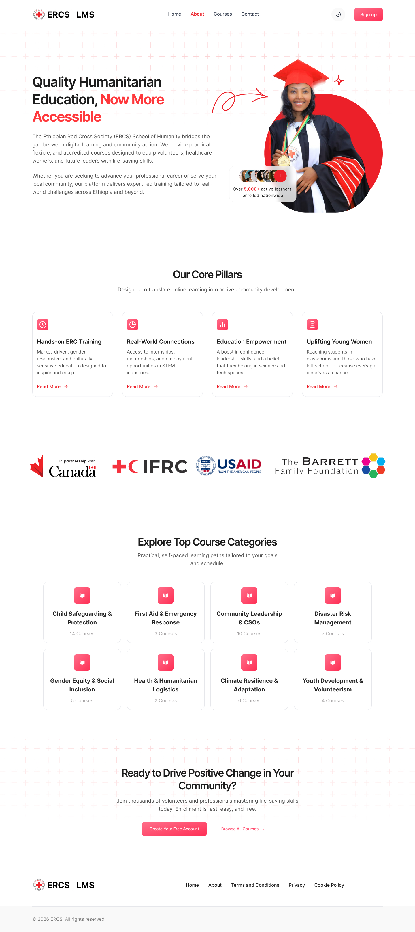
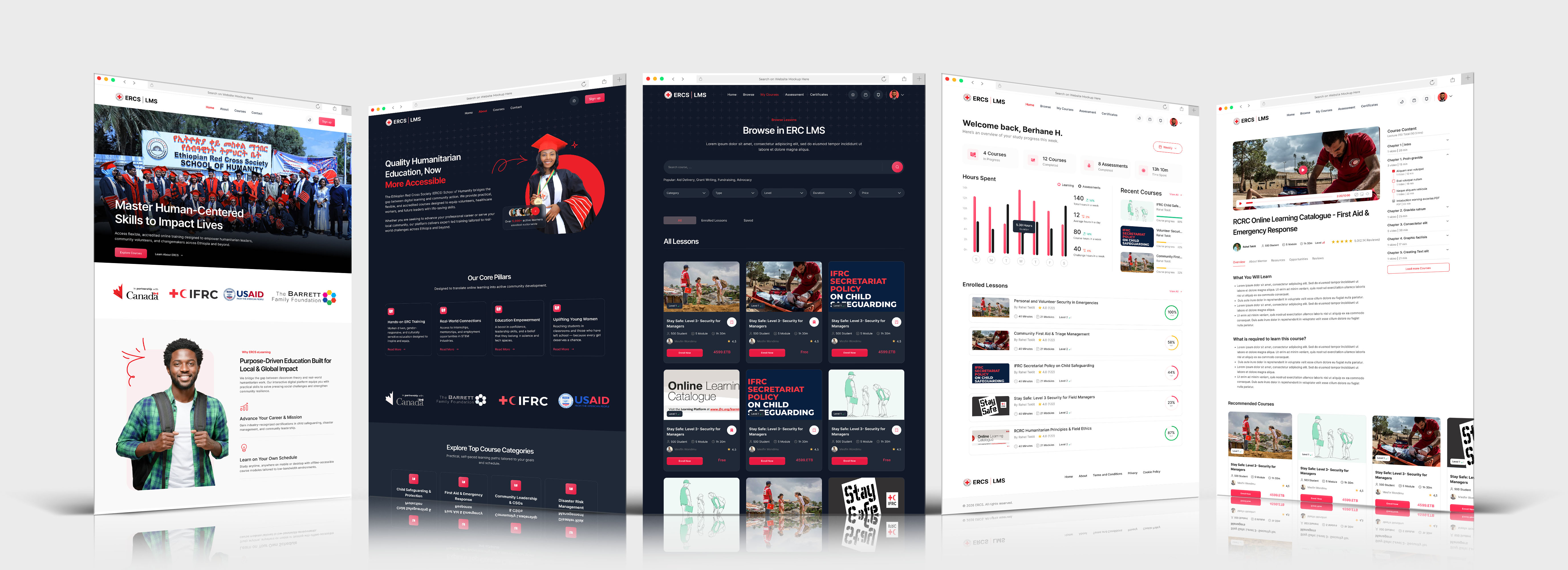
ERC LMS platform dashboard overview
Duration 6 Weeks
Role Product Design, UX/UI Design, Prototyping, Design System
Platform Responsive Web Application
Client Ethiopian Red Cross Society
Services UX Research, UI Design, Prototyping
Visit Website

Overview

How can we make online training easier for volunteers to actually use?

The existing experience made some parts of the learning journey harder than they needed to be. Finding courses, keeping track of progress, taking assessments, and accessing certificates didn't feel like one connected experience.

I redesigned the experience around four main steps:

The journey
Discover Learn Assess Certify

The Challenge

Making the learning journey easier to follow

Learners need to find the right course, know where they left off, understand their progress, complete assessments, and eventually access their certificates.

When these things are spread across different parts of the experience, it becomes easy to lose track of what to do next.

I focused on one main question:

“ How can we make the learning journey easier to understand from the first course search to the final certificate?.”

What I Focused On

I focused on four things that could make the biggest difference to the experience

Find the right training

Make it easier to search, filter, and understand courses before starting them.

Know what to do next

Make unfinished courses and progress easy to see so learners don't have to remember where they stopped.

Make assessments less stressful

Give learners a clear picture of their progress, remaining questions, and time.

Don't assume a perfect internet connection

Consider what happens when a learner loses connection during an important part of the experience.

Key Design Decisions

Four stages, of the learning experience

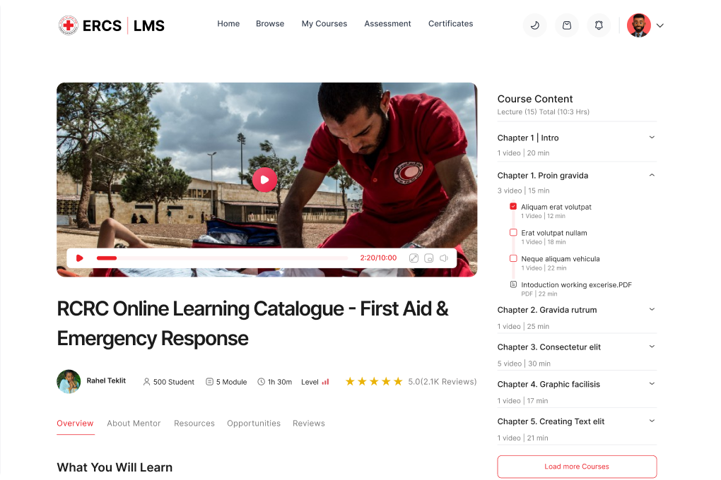
Interactive course lesson view with side drawer
01. Discover

Finding a course shouldn't take a lot of work

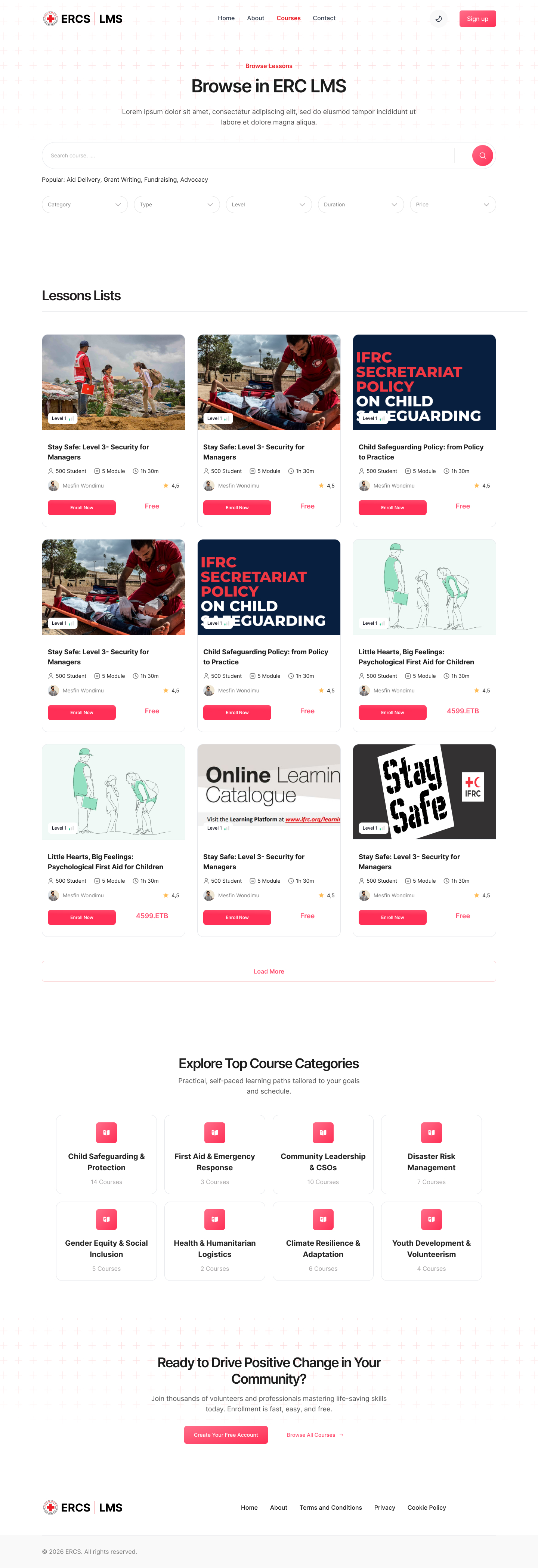
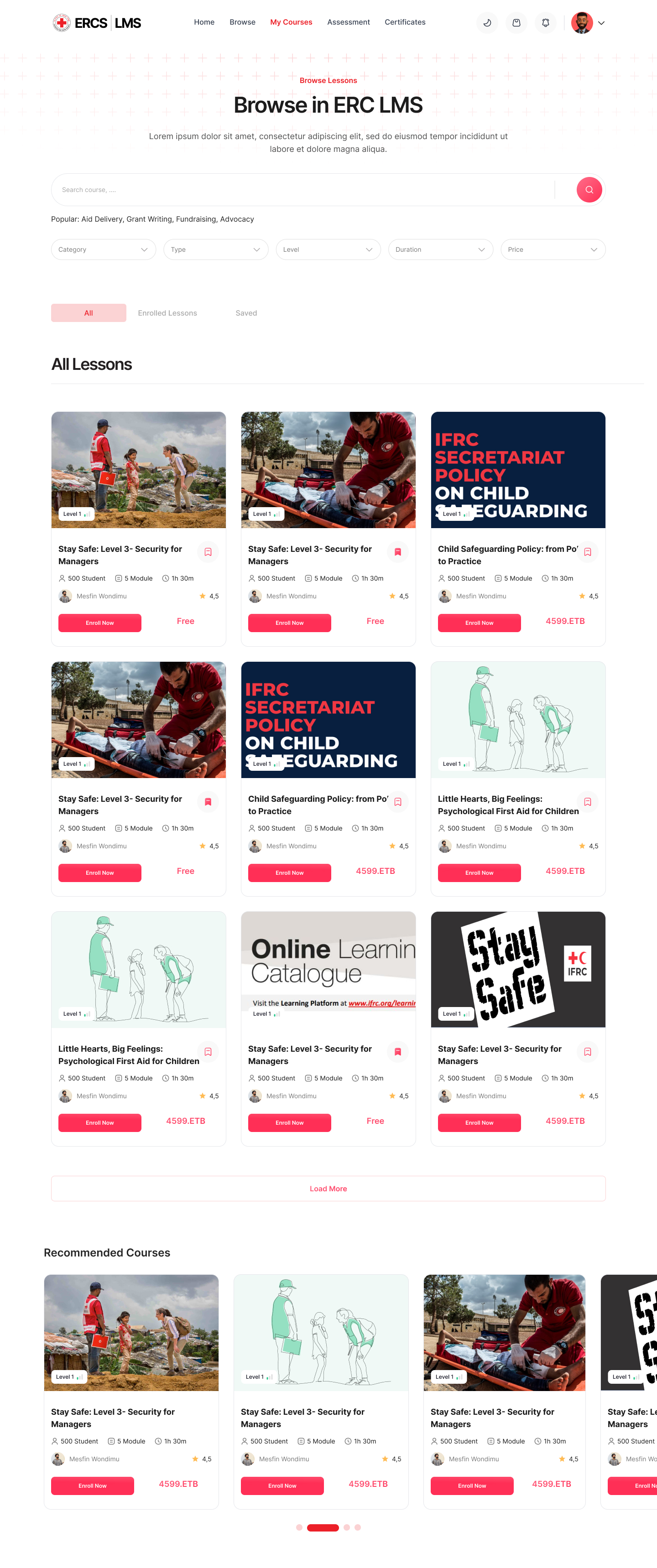
The course discovery experience brings search, filters, and useful course information together.

Learners can quickly see things like the course level, duration, and certification before deciding whether to open a course.

Focus: Search · Filters · Course information · Clear actions
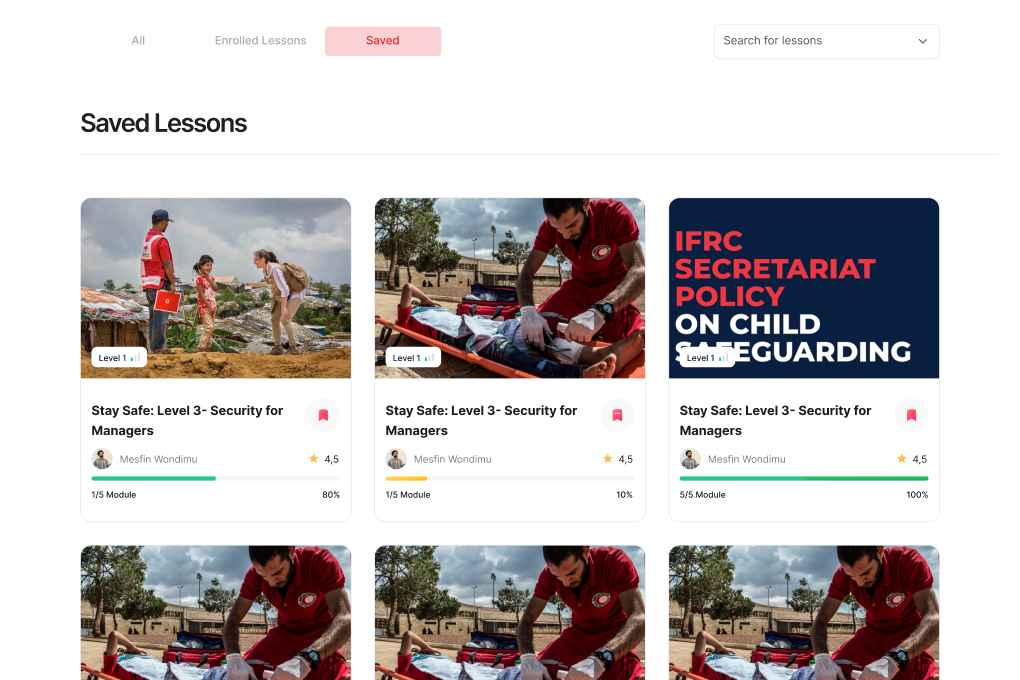
Saved lessons management interface
02. Learn

Make it easy to pick up where you left off

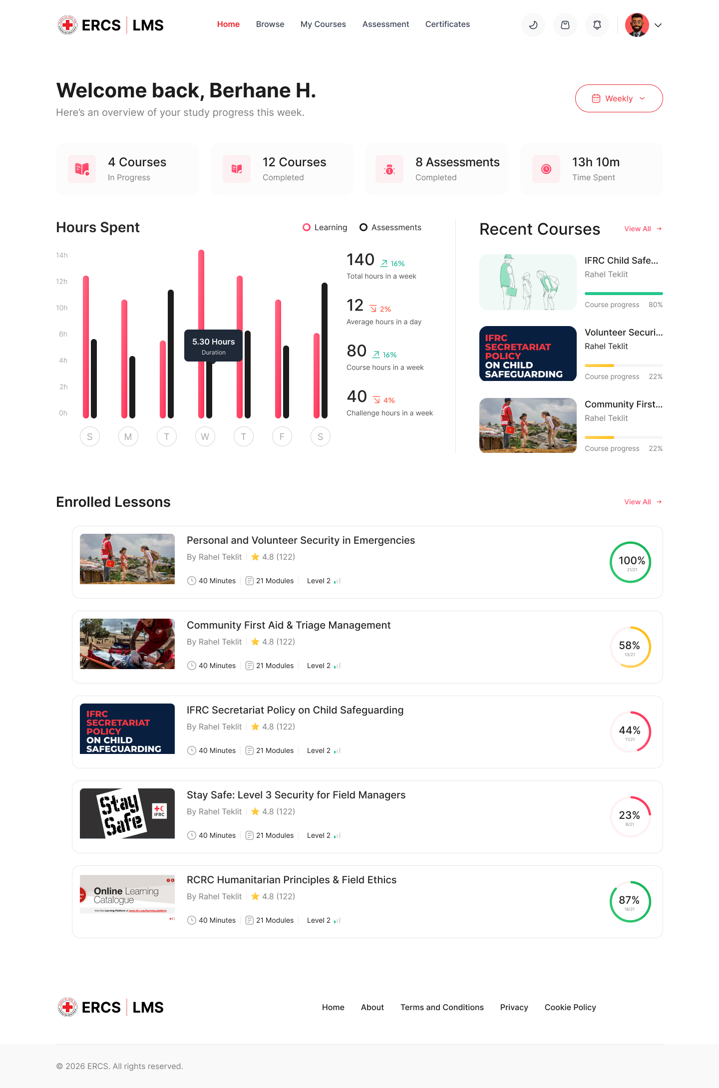
The Learning Hub puts active courses and progress where learners can see them.

Instead of looking through a long list of courses, learners can quickly return to something they started and understand what they should do next.

Focus: Continue learning · Progress · Next steps
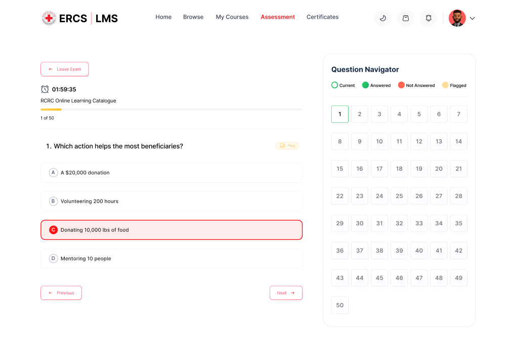
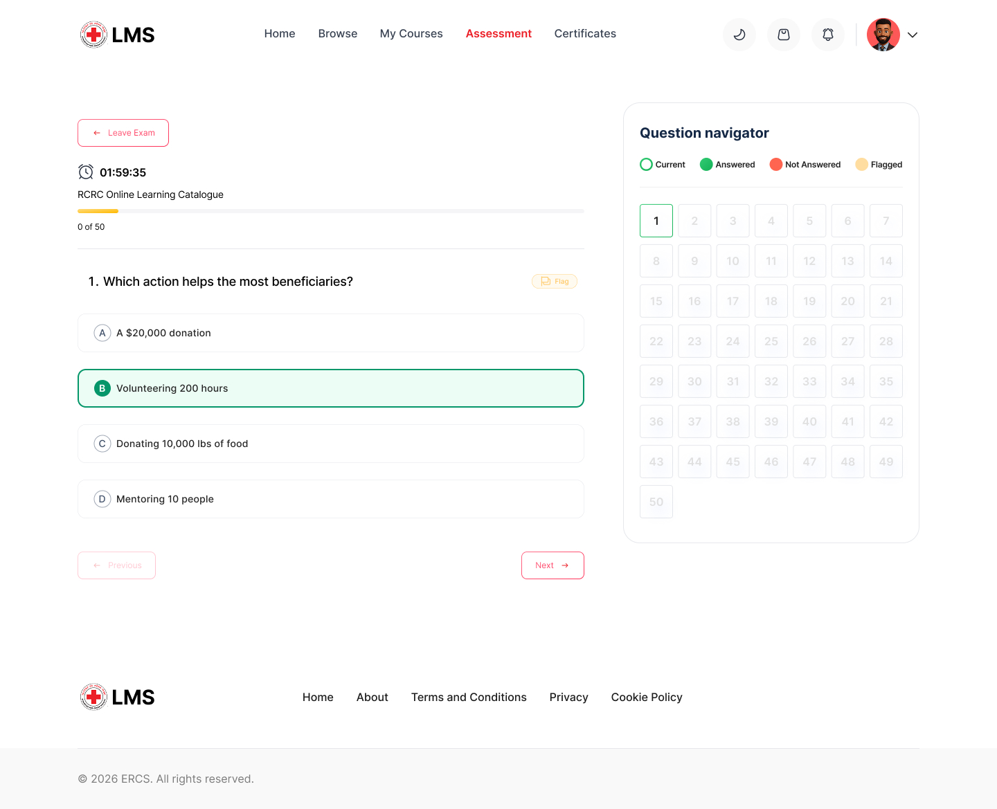
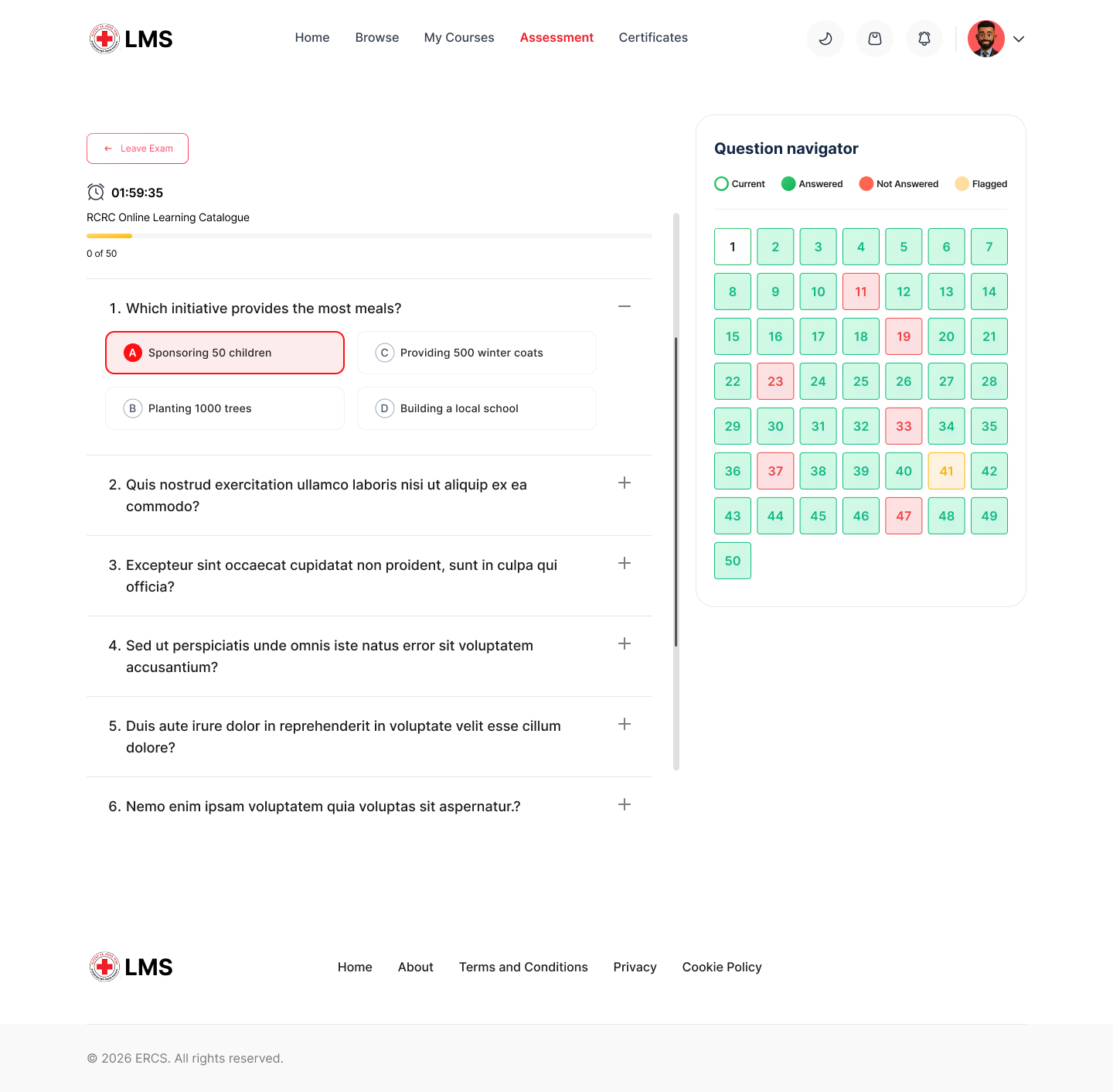
Exam container with question navigator
03. Assess

Give learners a better sense of where they are

Assessments can become stressful when you don't know how many questions you've completed, what you've skipped, or what you still need to review

Answered · Unanswered · Flagged · Current

The screen also keeps important information like the remaining time and assessment requirements easy to find.

The idea was simple: help learners stay in control without distracting them from the question they're answering.

Focus: Progress · Question states · Time · Review
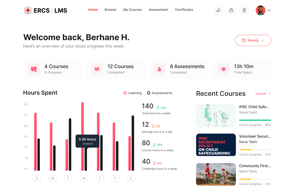
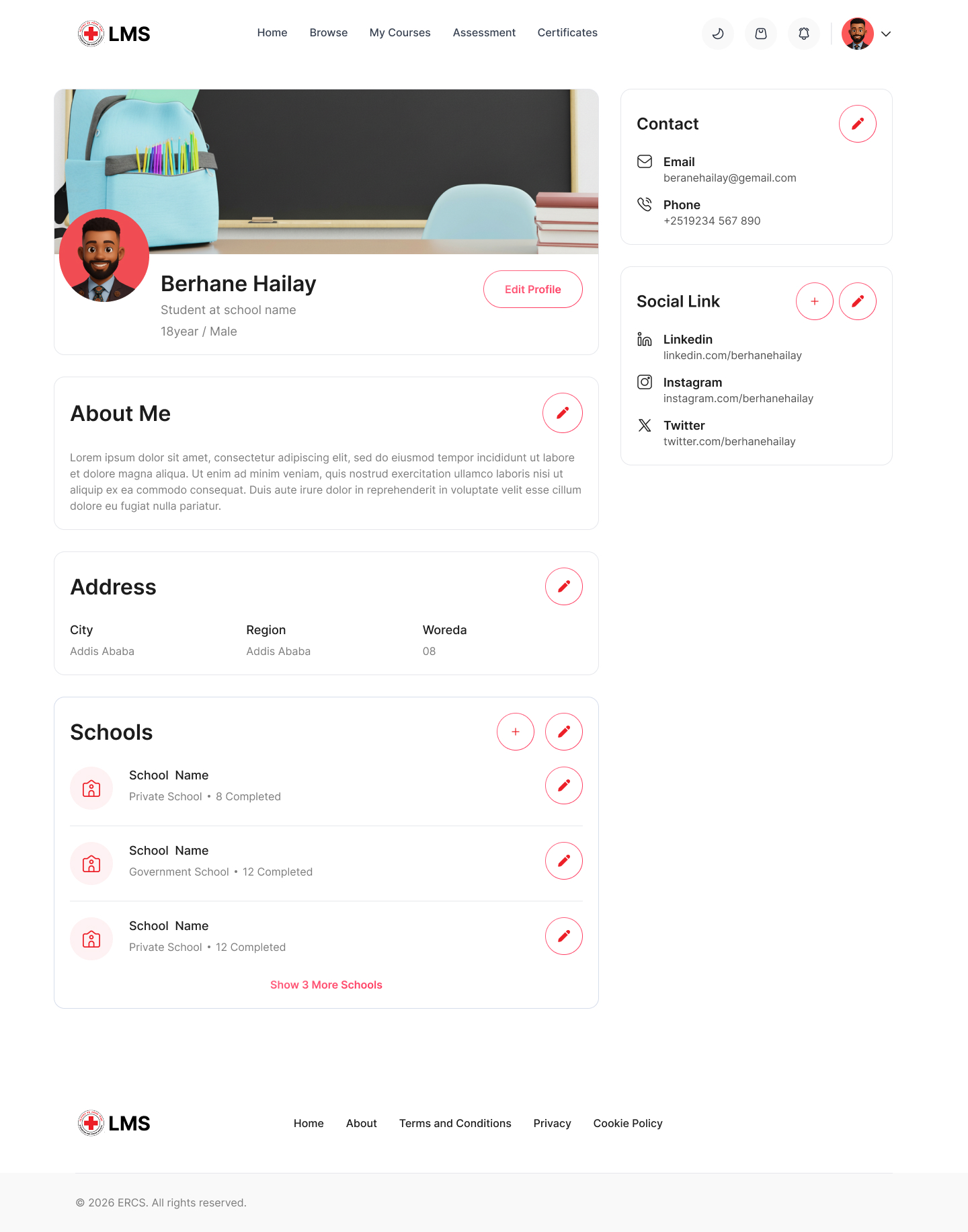
Learner dashboard with progress analytics
04. Certify

Make the end of a course feel clear

Finishing a course shouldn't leave learners wondering whether they've actually completed it or where their certificate went.

The certification experience connects course completion with the learner's certificates and achievements.

Focus: Completion · Certificates · Achievement history

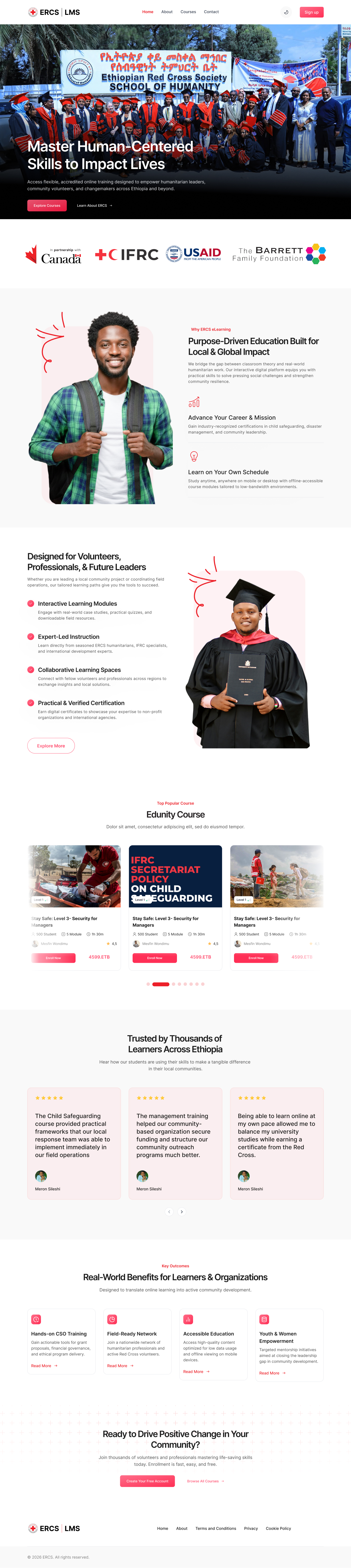
www.erclms.com
Hero screenshot
Dashboard screenshot
Footer screenshot
Footer screenshot
Footer screenshot
Footer screenshot
Footer screenshot
Footer screenshot

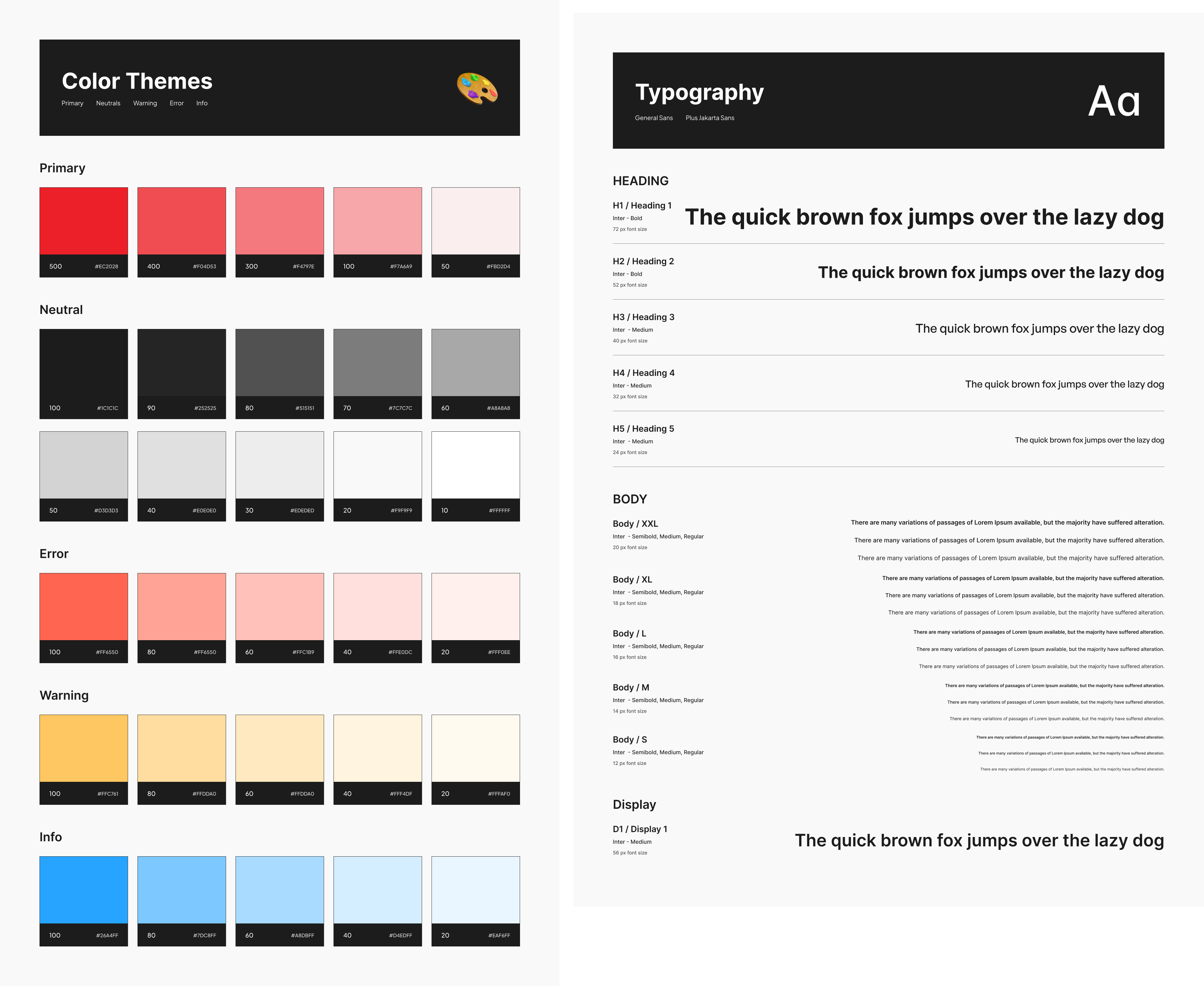
Design system

Keeping the experience consistent

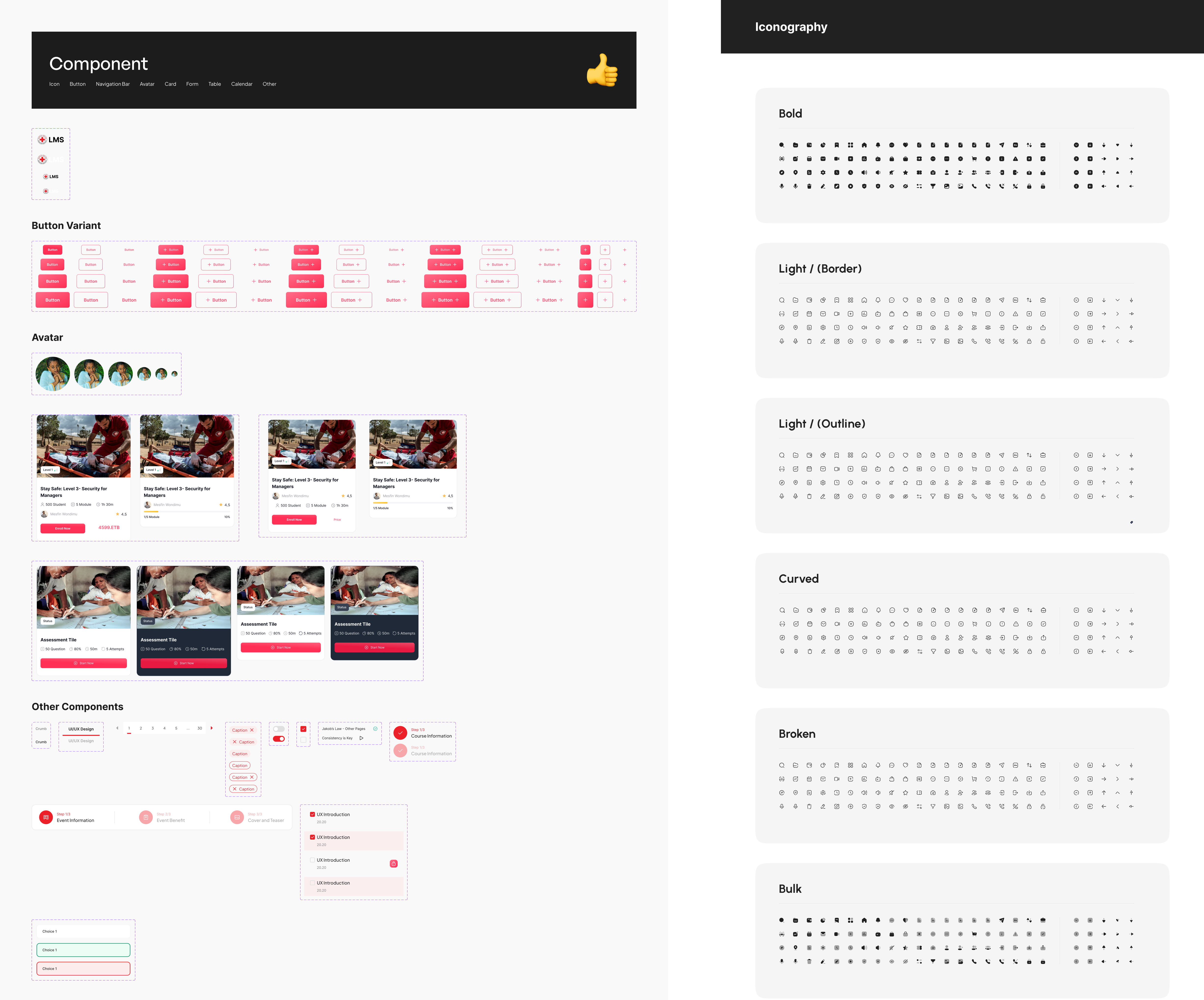
The LMS has quite a few different screens and interactions, so I created a small design system to keep everything feeling like part of the same product.

It covers:

Typography

A clear hierarchy for headings, course information, labels, and actions.

Color

A consistent approach to brand, success, warning, error, and informational states.

Components

Buttons, cards, inputs, filters, navigation, and progress elements.

Spacing

Consistent spacing and layout rules across the different screens.

style style

Outcome

Bringing the learning journey together

The final concept brings the main parts of the learning experience into one flow:

Discover → Learn → Assess → Certify

The design makes it easier to find training, pick up where you left off, understand assessment progress, and access certificates after completing a course.

Since this was a design concept and not a production release, I wouldn't claim specific improvements without testing them.

The next step would be to test:

  • How quickly learners find a relevant course
  • Whether they can easily continue unfinished training
  • How well they understand assessment progress
  • How easily they find their certificates

REFLECTION

The part I found most interesting

  • The assessment experience changed how I think about complexity.
  • At first, it looks like a simple question and answer screen. But once I considered the timer, progress, unanswered questions, flagged questions, and navigation, there was much more happening around the actual question.
  • The challenge wasn't just designing the question screen. It was giving learners enough information to stay oriented without making the interface feel overwhelming.
  • That pushed me to think more about information hierarchy and interaction states, rather than focusing only on the visual design.

Next case study

View All Works →